> ## Documentation Index
> Fetch the complete documentation index at: https://docs.zionapp.co/llms.txt
> Use this file to discover all available pages before exploring further.
# Attendance trends
> Trend analysis and centre comparison for attendance rates over time
Trends shows how attendance moves over time, what patterns are driving it, and how learning centres compare to each other. Administrators see it school-wide. Supervisors see it for their own assigned centre.
## Who can see this page
| Role | Access |
| ------------------------ | ------------------------------------------------------------------------- |
| Administrator | The whole organization, with a Centre Comparison view across every centre |
| Supervisor | Their own assigned centre only |
| Monitor, parent, student | No access |
Access is scoped the same way as the attendance dashboard: an administrator sees the full organization, a supervisor is limited to their assigned learning centre.
## Opening Trends
From the sidebar, go to **Attendance**, then **Trends**.
At the top of the page, Zion shows students tracked, the average attendance rate, the current trend direction, and the best and lowest day for the selected range.
Most of the page follows one range at a time: 7 days, 30 days, the current term, or a custom start and end date. Each chart carries its own range control, so you can look at a longer window for one chart and a shorter one for another.
## The summary row
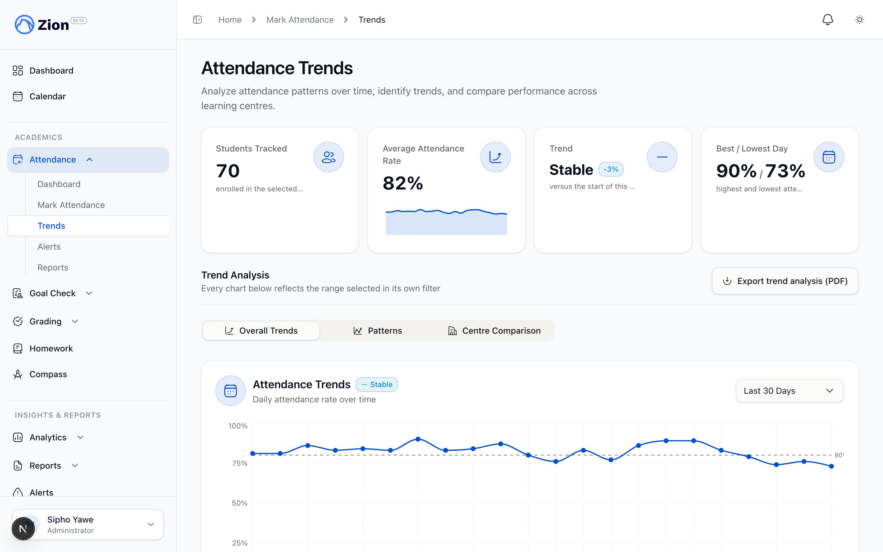 | Metric | Description |
| ----------------------- | -------------------------------------------------------------------------------------- |
| Students tracked | Students with an attendance record in the selected range |
| Average attendance rate | Mean attendance rate across the range, with a small trend line |
| Trend | Improving, stable, or declining, with the percent change versus the start of the range |
| Best / lowest day | The highest and lowest single-day attendance rate in the range |
## Overall Trends
For administrators, this is one of three tabs on the page (the others are Patterns and Centre Comparison, described below). It plots a daily attendance rate across the range you choose, using present, absent, and late counts recorded for each day. Supervisors see the same chart without the tabs, since their view only ever covers their own centre.
## Patterns
The Patterns tab brings together a few ways to spot what is driving a change in attendance:
* **Pattern insights.** A short list of auto-generated, plain-language highlights drawn from the data in the selected range, for example a day of the week that consistently runs lower than the rest.
* **Day-of-week pattern.** Average attendance rate for each weekday (Monday through Friday) across the range, so you can see if a particular day is weaker than others.
* **Centre outliers.** Centres whose attendance rate stands out from the organization average by more than one standard deviation, flagged with how far above or below average they are. This helps you see whether a dip is limited to one centre or affects the whole organization.
* **Per-student trend.** Pick any student to see their own attendance rate over the range, plotted as a line, with an improving, stable, or declining indicator.
Both administrators and supervisors see the Patterns tab, scoped to the centres they can access.
## Centre Comparison
Administrators get a third tab that plots average attendance rate for every learning centre over time on one chart, alongside the organization average, so the strongest and weakest performers are easy to spot at a glance. Centres can be toggled on and off in the chart. This tab is not available to supervisors, since it compares across the whole organization.
## Exporting the trend analysis
From the Patterns tab, select **Export trend analysis (PDF)** to download the day-of-week breakdown, the centre outliers, and the pattern insights as a PDF. The export is disabled when there is not enough data in the selected range.
## Related pages
How marking, alerts, and reports fit together.
Generate and export detailed attendance reports.
How warning and critical alerts are generated and acknowledged.
Daily attendance monitoring and oversight for administrators.
Marking and monitoring attendance for your centre.
| Metric | Description |
| ----------------------- | -------------------------------------------------------------------------------------- |
| Students tracked | Students with an attendance record in the selected range |
| Average attendance rate | Mean attendance rate across the range, with a small trend line |
| Trend | Improving, stable, or declining, with the percent change versus the start of the range |
| Best / lowest day | The highest and lowest single-day attendance rate in the range |
## Overall Trends
For administrators, this is one of three tabs on the page (the others are Patterns and Centre Comparison, described below). It plots a daily attendance rate across the range you choose, using present, absent, and late counts recorded for each day. Supervisors see the same chart without the tabs, since their view only ever covers their own centre.
## Patterns
The Patterns tab brings together a few ways to spot what is driving a change in attendance:
* **Pattern insights.** A short list of auto-generated, plain-language highlights drawn from the data in the selected range, for example a day of the week that consistently runs lower than the rest.
* **Day-of-week pattern.** Average attendance rate for each weekday (Monday through Friday) across the range, so you can see if a particular day is weaker than others.
* **Centre outliers.** Centres whose attendance rate stands out from the organization average by more than one standard deviation, flagged with how far above or below average they are. This helps you see whether a dip is limited to one centre or affects the whole organization.
* **Per-student trend.** Pick any student to see their own attendance rate over the range, plotted as a line, with an improving, stable, or declining indicator.
Both administrators and supervisors see the Patterns tab, scoped to the centres they can access.
## Centre Comparison
Administrators get a third tab that plots average attendance rate for every learning centre over time on one chart, alongside the organization average, so the strongest and weakest performers are easy to spot at a glance. Centres can be toggled on and off in the chart. This tab is not available to supervisors, since it compares across the whole organization.
## Exporting the trend analysis
From the Patterns tab, select **Export trend analysis (PDF)** to download the day-of-week breakdown, the centre outliers, and the pattern insights as a PDF. The export is disabled when there is not enough data in the selected range.
## Related pages
How marking, alerts, and reports fit together.
Generate and export detailed attendance reports.
How warning and critical alerts are generated and acknowledged.
Daily attendance monitoring and oversight for administrators.
Marking and monitoring attendance for your centre.